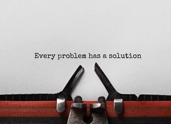
Picking the right font used to mean bouncing between five different tabs: one site for downloads, another for license checks, a third just to actually see how the font looks once real text gets dropped into it, and maybe a fourth just to convert the file into a format your project could actually use. It was tedious, slow, and honestly more frustrating than the design work itself. Fontlu: The Ultimate Typography Engine for Modern Designers and Creatives was built specifically to close that gap, bringing font discovery, live testing, and customization into a single workspace instead of a scattered, multi-tab routine that ate up more time than it should have.
Fontlu approaches typography differently from most font websites do. Instead of treating a font as just a file to download and forget, Fontlu treats the entire process of searching, previewing, adjusting, and exporting as one continuous workflow. That shift matters more than it sounds like it should, because the gap between “this font looks nice in a sample word” and “this font actually works in my real headline” is exactly where most bad typography decisions happen. Fontlu closes that gap by letting you test fonts with your own text before you ever commit to one.
Whether you’re a freelance designer juggling five client logos at once, a developer picking type for a brand-new app interface, a small business owner building your first Instagram brand kit, or a student just trying to make a school project look more polished, Fontlu aims to remove the guesswork that usually comes with choosing typography. It’s built to work for complete beginners and seasoned professionals alike, which is part of why Fontlu has become a recurring name in conversations about modern font tools.
Table of Contents
What Fontlu Actually Does?
Most font websites are built around one job: letting you download a file. Fontlu takes a different approach by treating typography as an ongoing creative process rather than a single transaction.
At its core, the platform combines a searchable font library with live editing tools, so you’re not stuck imagining how a typeface might look; you can see it instantly, styled with your own text, before committing to anything.
This matters more than it sounds. A font that looks elegant in a generic sample word might fall apart once it’s stretched across an actual headline or squeezed into a mobile button. Fontlu’s real-time approach catches that mismatch early, before hours get sunk into a layout built around the wrong typeface.
Core Features Worth Knowing
1.A Large, Constantly Refreshed Font Library
The collection has a range of fonts from simple sans serifs to fancy calligraphy scripts. It includes both free and paid options. New fonts are added often, which is important in the design world because font trends change quickly, just like color trends do.
2. Live Preview Without Downloading Anything First
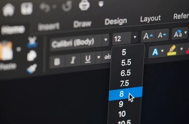
You can write your headline or brand name in the editor and see what it looks like in the font you want to use. The editor shows you how it will look.. You can make the text bigger or smaller. Change the spacing between the words.
You can also change how the words line up on the page.
This helps you find problems, like words that are too close together or hard to read when they are small. You can fix these problems before you even save the file to your computer.
3. Smart Filtering by Mood and Use Case
Then, looking through a lot of mixed-up entries, you can sort by category. The categories are
- serif
- sans-serif
- script
- display
You can also sort by how you want your text to feel. The feelings are
- playful
- corporate
- futuristic
- handwritten
There are also tags for uses. These uses are, like
- headline
- UI text
- branding
These tags help most when you already know the job a font needs to do, even if you are not sure exactly which type of font fits best.
4. Broad Format Support
Whether your project needs OTF, TTF, WOFF, or WOFF2, the platform handles conversion so the same font works whether you’re building a website, designing packaging, or laying out a printed brochure.
5. Built-In Fine-Tuning Tools
Beyond just picking a font, you can adjust kerning, line height, and letter spacing directly in the platform — useful for logo work especially, where even a slightly cramped letter pairing can throw off an entire brand mark.
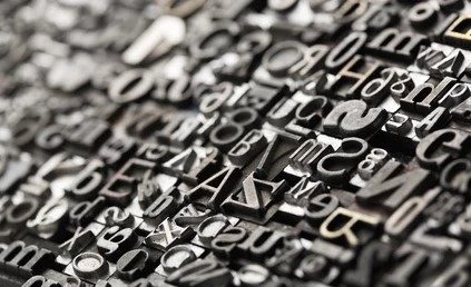
Font Basics Every Designer Should Know
Before diving into a massive library, it helps to understand what you’re actually choosing between. Here’s a quick refresher on the four major font families:
- Serif fonts
Have small finishing strokes at the ends of letters. They read as traditional and trustworthy, which is why they show up so often in printed books, legal documents, and heritage branding. - Sans-serif fonts
Drop those finishing strokes entirely, giving a cleaner, more modern look. They tend to render more clearly on screens, which is why most apps and websites default to this family. - Script fonts
Mimic handwriting, ranging from elegant calligraphy to casual cursive. They work best in small doses — a logo or wedding invitation, not a full paragraph of body text, since long stretches of script become genuinely hard to read. - Display fonts
Display fonts are bold and attention-grabbing by design. They’re meant for short headlines or posters, not extended reading, because their stylistic flourishes that look striking in three words start to fight each other across three sentences.
Getting Started: A Step-by-Step Walkthrough
Step 1 . Search or browse. Use a specific phrase like “bold fonts for headlines” or “elegant script for invitations,” then narrow further using the style and mood filters.
Step 2. Test it live. Type your actual brand name or sample text into the preview tool so you’re judging the font in context, not in isolation.
Step 3 . Save what works. Creating an account lets you bookmark fonts you’re considering, which is handy when you’re comparing five or six options across a single project.
Step 4 . Export in the right format. Choose OTF, TTF, or a web-optimized format depending on where the font is headed print, app, or browser.
Step 5. Check the license before using it anywhere in public. Every font listing should clearly state whether it’s free for personal use only, free for commercial use, or requires a paid license. Skipping this step is the single most common mistake designers make with free font sites.
Where Fontlu Fits Into Real Projects
Branding and logo design. Typography often carries as much brand personality as a color palette does. A distinctive, well-paired typeface can make a logo memorable in a way that generic system fonts never will.
Web and app interfaces. Screen-optimized fonts need to stay legible at small sizes across many devices, which rules out a lot of decorative options that look great in a mockup but fall apart on an actual phone screen.
Social media graphics. Bold, distinctive type tends to stop the scroll faster than safe, default choices — useful for anyone trying to make a post stand out in a crowded feed.
Print and packaging. High-resolution, print-ready font formats matter here in a way they don’t for digital work, since print has no forgiveness for low-quality rendering.
Motion graphics and video. Titles, lower-thirds, and animated text all need fonts that hold up in movement, not just in a static frame.
Fonts Currently Gaining Attention
Typography trends shift constantly, and a few styles tend to dominate creative feeds at any given time. Right now, that generally includes:
- Clean geometric sans-serifs favored by premium and minimalist branding
- Loose, casual handwritten styles are used to add warmth to otherwise polished designs
- Sharp, technical monospace fonts borrowed from coding culture and adapted for editorial design
None of these trends is purely about looking current; each one solves a specific communication problem, whether that’s projecting trust, approachability, or precision.
How Fontlu Compares to Other Font Platforms
The world of finding fonts is not empty. We have Google Fonts, DaFont, Adobe Fonts, and many others that have been helping designers for some time. What makes one platform different from another is what it can do. Most of these platforms do one thing. They do it well. But a platform like Fontlu is trying to do everything. It wants to help you find fonts, try them out, make it clear how to use them, and let you download them. All in one place which is fontule.
| Platform | Known For | Where It’s Limited |
|---|---|---|
| Google Fonts | Massive open-source library, strong web integration | Minimal customization, no live brand testing |
| DaFont | Huge free selection, hobbyist favorite | Licensing terms are often unclear or buried |
| Adobe Fonts | Premium font quality, deep Adobe integration | Locked behind a Creative Cloud subscription |
| Font Squirrel | Hand-vetted, commercial-safe fonts | Smaller library, fewer customization tools |
| Canva Fonts | Convenient inside Canva’s own editor | Fonts aren’t usable as standalone downloads |
The choice is usually between depth and convenience. Google Fonts is the best when it comes to the number of fonts it has and how well it works on the web. Adobe Fonts is the best when it comes to the quality of the fonts it has, especially if you are already paying for Creative Cloud.
A platform that combines everything is really useful because it means designers do not have to have a lot of tabs open at the same time. Google Fonts and Adobe Fonts are both useful, though they are not a replacement for people who specialize in fonts.
Licensing and Commercial Use
This is the part most beginners skip. Its also the part that causes the most trouble later on. Fonts usually fall into three categories:
- Personal use only. This is okay for a school project or a personal blog but not for anything that makes money.
- Free for use. This is safe for client work and products but some fonts still need you to give credit.
- Paid license. You need this for fonts used in logos, paid products or big campaigns.
A platform that clearly labels the licensing for every font helps to remove a legal risk. Using a font without a license in client work can lead to takedown requests. In some rare cases legal action, from the font creator.
Typography Problems It Helps Solve
Bad typography is something that you usually do not notice away. It just makes a design look a little bad. You do not know why. The things that can make typography look bad are when the letters are too close together when the words are not easy to read because the background is too similar, to the words and when the type of font used does not fit with what the brand’s really like.
Using tools that show you what something will look like before it is finished can help you find these problems on. When you see the words you want to use in the font you have chosen instead of just some random words you can see right away if there are any problems. You might notice that the letters are too close together or that the lines of text are breaking up in a way or that the tone of the text is not what you wanted it to be. Typography is important and live preview tools can help you get it right.
Is It Trustworthy?
When you are looking for a good font platform it should have some things. The font files should be updated often. Checked to make sure they are good. The platform should also have a way to download fonts and paperwork that shows the licensing is real.
For designers who download fonts to use for their clients it is very important that they know what they can and cannot do with the fonts. They should only use a font platform that clearly says what is allowed it is not something that’s just nice to have it is something that is necessary. A good font platform should have licensing this is what designers need when they are working with fonts, for their clients.
What’s Coming Next
Font platforms are trying things. They are using intelligence to suggest which fonts go well together. They are also adding support for types of letters, like Arabic and Devanagari. This means people who speak languages can use these fonts. Font platforms are also letting teams work together on font choices. They can talk about the fonts and vote on them. Some font platforms have rating systems now. This helps designers see how easy a font is to read before they decide to use it. Font platforms and their rating systems are making it easier for designers to pick fonts. Designers can look at the font ratings. Get an idea of the fonts readability.
Final Thoughts
Typography is something that people do not usually notice. It really affects how people feel about a brand. It can make a brand seem trustworthy, modern or friendly in a short time.
A platform that lets designers try out fonts and see how they will look and also makes it easy to get the right to use them saves designers a lot of time. They do not have to spend hours trying to figure things out.
If you are making a graphic for social media or creating the typography, for a whole brand it is very helpful to have one place to look for fonts see what they look like and download them. You should not have to use different tools to do this. Having one place to do all these things is a thing that designers needs.
FAQ’s About Fontule
Q1.Is Fontlu free to use?
Many platforms in this category offer a mix of free and premium fonts, so it depends on the specific typeface — always check the listed license before downloading.
Q2.Can these fonts be used commercially?
Usually yes, but only if the specific font is labeled for commercial use. Always confirm the license tied to each individual font rather than assuming the whole library follows one rule.
Q3.Can users contribute their own fonts?
Many font platforms allow type designers to submit fonts for inclusion, which is part of how these libraries stay continuously updated.
Q4.How is this different from Google Fonts or DaFont?
The main difference is workflow consolidation — combining discovery, live preview, licensing information, and export options into one place instead of requiring multiple separate tools.
Q5.Is this beginner-friendly?
Generally yes. A clean interface and built-in guidance around font basics and licensing make these platforms accessible even for people with no formal design background.